Client: Urban Sports Club
Urban Sports Club was founded with one bold ambition: to disrupt the industry by making sports available through one streamlined access point. Giving customers access to Europe’s most flexible and diverse sports offer – all with just one membership.
As Global Head of Brand + Design, I was entrusted to build the brand from the ground up, and assemble and lead a team of talented creatives to inspire customers with a compelling, coherent brand experience.
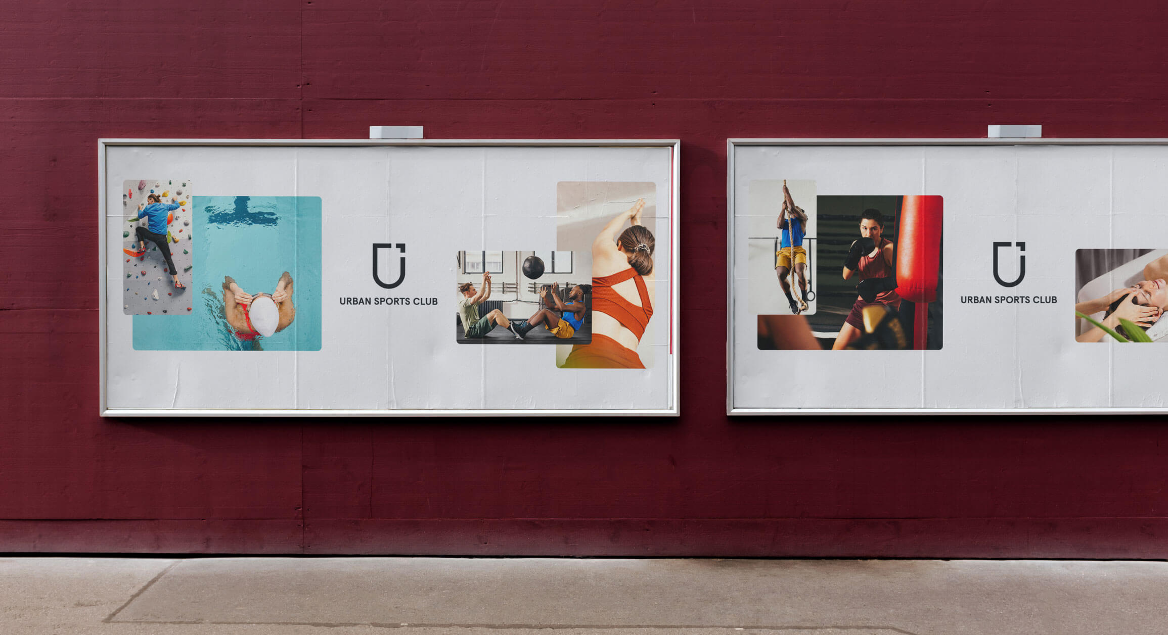
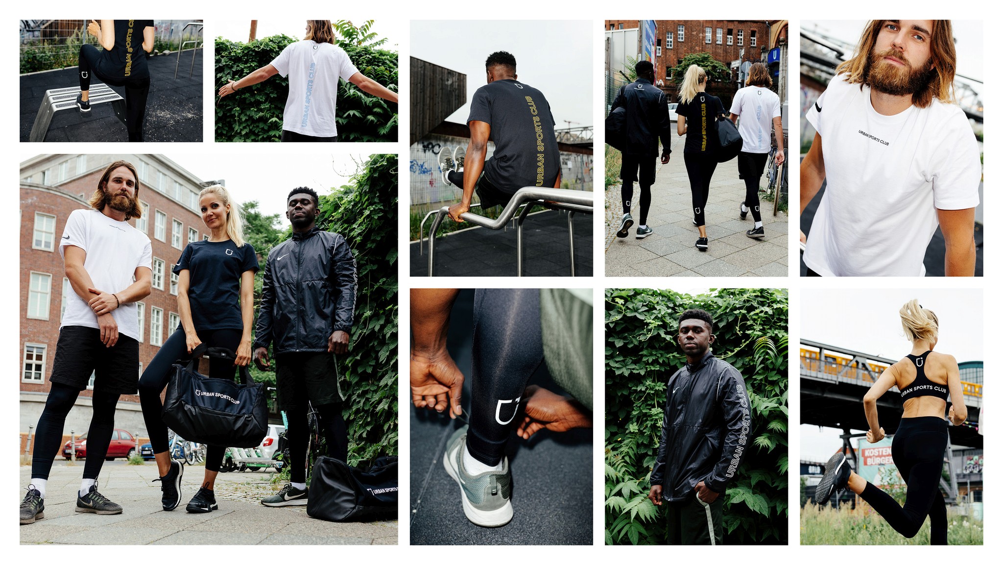
We developed a new brand strategy to position and differentiate Urban Sports Club within the market. Launching a unique visual and verbal identity into all different touchpoints and creating multiple brand campaigns in different markets.
The goal is to position the brand as an inclusive, community-driven service that sparks the joy of sports, builds meaningful relationships with its community, and thereby inspires people to discover a personalized approach to an active, healthy life.
Services
Brand Strategy
Brand Identity
Creative Direction
Creative Leadership
The Logo
We call our logo "Unicon" - a minimalistic mark, a visual representation of the values of Urban Sports Club. We have created a logo that is easy to use and remember. The coat of arms symbolizes our affiliation to our Urban Sports Club Community.
Our visual identity is designed to inspire people to join our movement and help us get closer to our vision.
The Custom Font
Another key part of the visual identity is a unique custom font based on the original Aperçu designed by Colophon Foundry.
It was chosen to fit our visual language and slightly changed to be coherent with our Logotype. Aperçu Aktiv allows us to be versatile enough to create hierarchy in all our communication, while still having a strong character, consistency and clarity.
The Illustration System
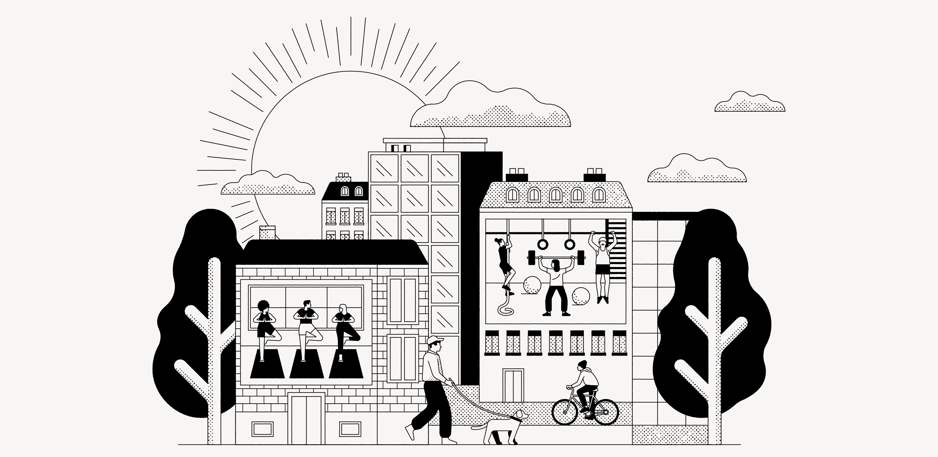
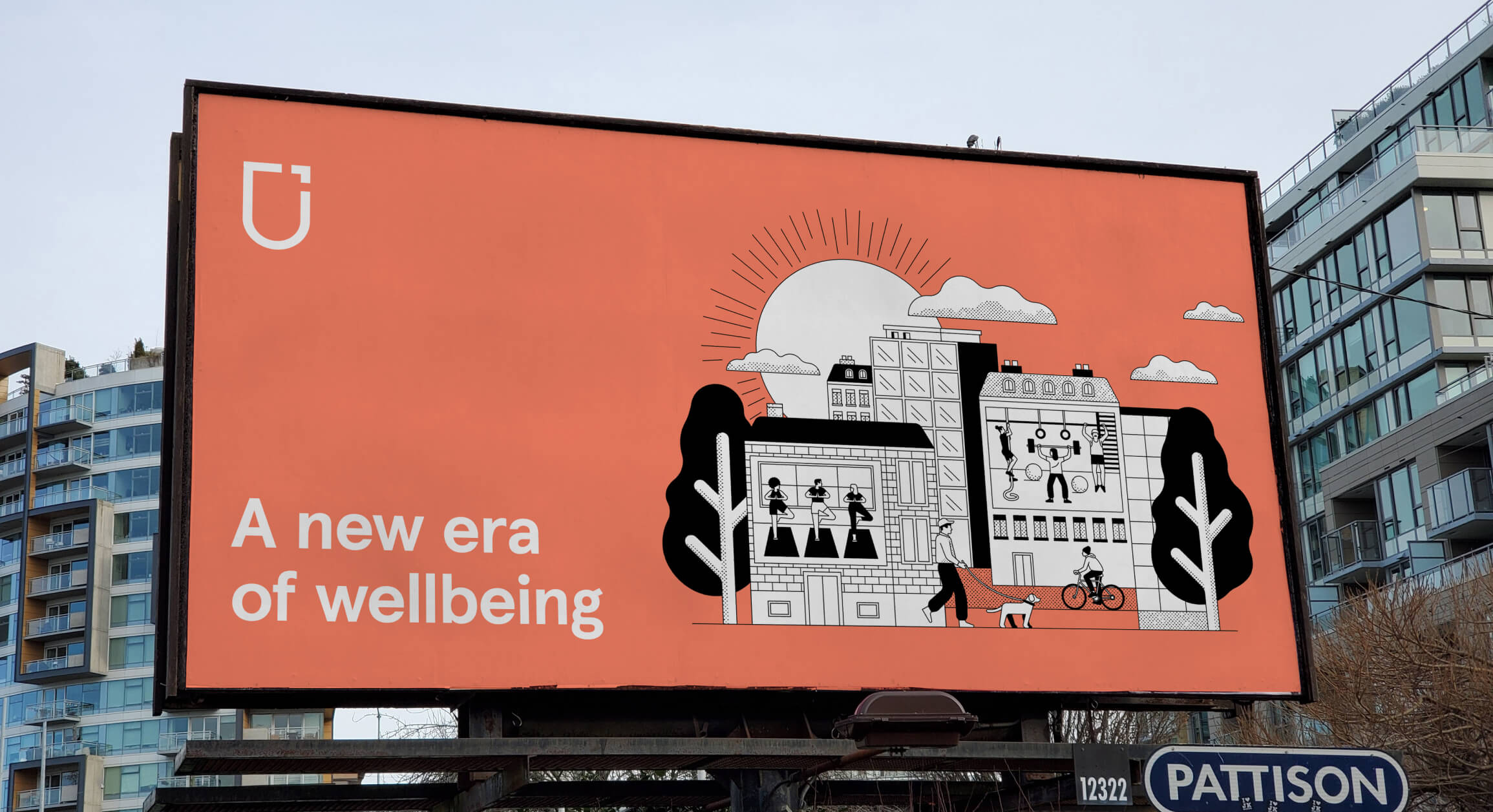
A series of illustrations designed for use across various channels and touchpoints of the Urban Sports Group brand.
Illustrations should play a supporting role alongside photography, aiding in the communication of complex ideas and reducing dense blocks of copy.
The Digital Brand Hub
In order to keep all relevant brand assets, templates and guidelines such as Tone of Voice in one place, we developed our own digital brand platform - providing information about our brand core the public and having a protected area for the team to work always on-brand.
Digital Product Revamp
(App & Website)
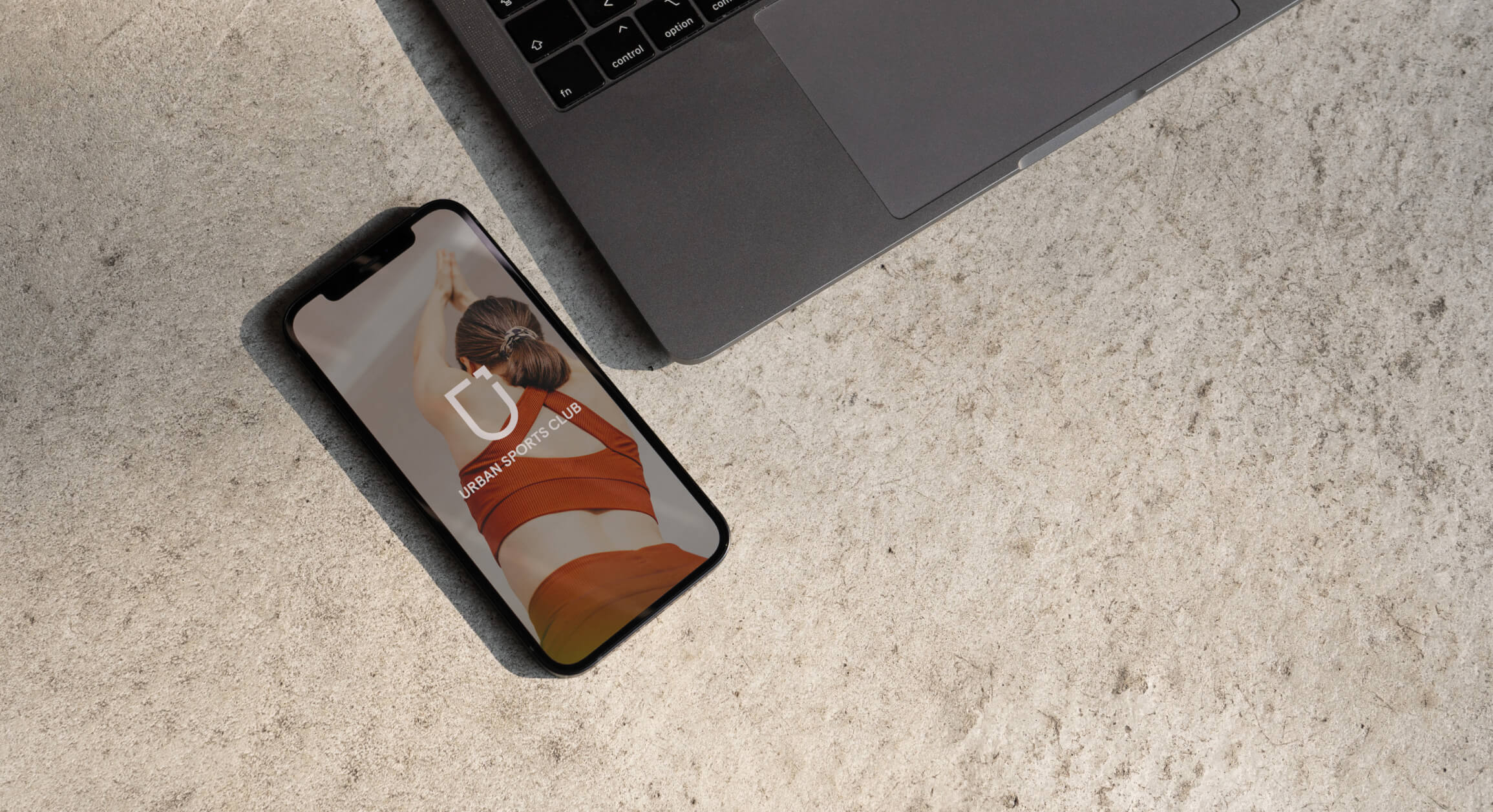
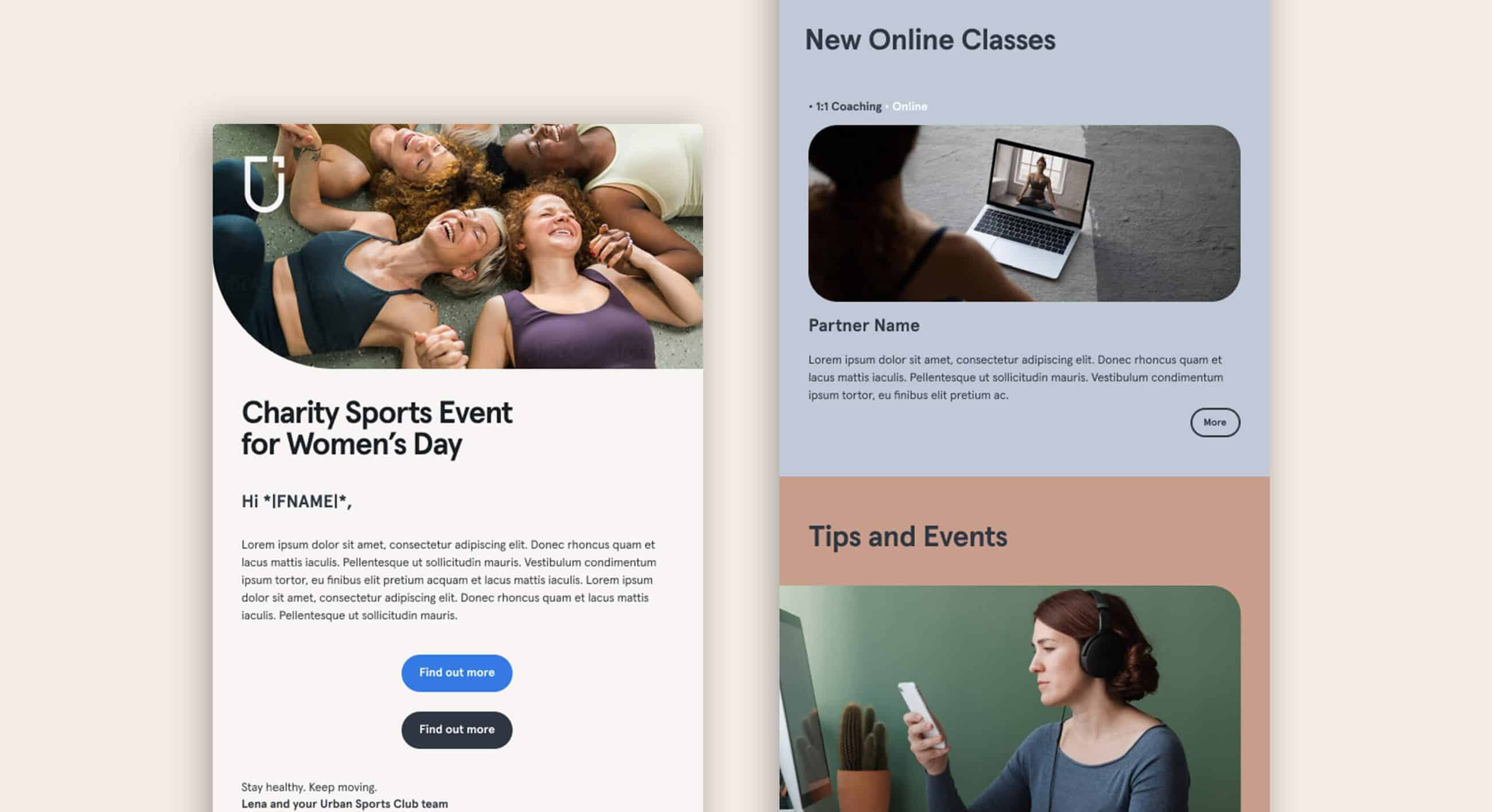
Furthermore we infused the new brand experience and identity into the UI/UX of our digital product.
This alignment not only fosters familiarity but also communicates the brand's values and personality cohesively. Through a consistent design language and user-centric interactions, we enhance engagement, crafting a distinct and memorable experience. By merging brand identity with UI/UX, we're able to forge deeper connections and stand out prominently in the digital landscape.
© Glutz von Blotzheim 2024

